When Apple introduced the Liquid Glass design last year, the goal was to give its operating systems a more modern and dynamic appearance through translucent interface elements that react to the content displayed on screen. The redesign marked one of the biggest visual changes to the iPhone in years, but not every user was impressed.
The most common complaints centered on the readability of text and buttons in certain situations.
Now, with iOS 27, Apple is introducing a series of refinements designed to make Liquid Glass more practical while preserving the visual identity that has come to define its operating systems.
Apple improves readability across the interface
The biggest changes happen behind the scenes. Apple has modified how the Liquid Glass effect interacts with the content displayed behind interface elements.
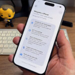
In practice, the system now diffuses background images, colors, and information more effectively, making text easier to read and increasing overall contrast throughout the interface.
The company has also added darker outlines around translucent elements and enhanced reflections to create clearer visual separation between different components on the screen.
These adjustments are a direct response to criticism the design received following its debut.
New control lets users adjust system transparency
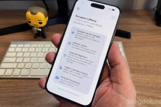
One of the most interesting additions is a dedicated control that allows users to adjust the intensity of the Liquid Glass effect.
Within iPhone settings, users can choose their preferred level of transparency, ranging from an almost fully transparent appearance to a more opaque and colorful version of the interface.
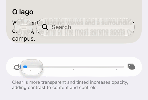
Unlike the limited options previously available, the new control offers a gradual adjustment, allowing each user to personalize the appearance of the system according to their preferences.
The feature also benefits users who prefer interfaces that are easier to read, especially outdoors or in brightly lit environments.
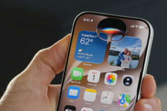
Floating bars become easier to see
Apple also focused on improving navigation bars that remain visible while users scroll through content.
In iOS 27, whenever content moves behind these bars, the system automatically creates a uniform layer to preserve the readability of text and icons. The result is a more consistent interface that is less prone to contrast issues.
App icons receive a sharper look
Application icons are also receiving visual improvements.
According to Apple, the new rendering system makes icons appear sharper and better defined, addressing one of the most common criticisms of the previous design.
The company has also refined the refraction effects used throughout Liquid Glass, creating a stronger sense of depth without compromising visual clarity.
For developers, Apple has updated the Icon Composer tool, allowing the creation of icons with multiple Liquid Glass layers and providing new customization options.
Liquid Glass is here to stay
Before WWDC 2026, rumors suggested Apple might significantly reduce the presence of Liquid Glass following the criticism it received over the past year. Instead, the company did exactly the opposite.
The design remains a central part of iOS’s visual identity, but it is now accompanied by refinements focused on usability, accessibility, and personalization.
The strategy is reminiscent of what happened after the launch of iOS 7, when Apple maintained its new visual language while spending years refining details based on user feedback.